
Project Title
HTML 5 Website
Role
Web Application, Angular, CMS
Date
June, 2014
Client
King & Villain & Co.
The Brief
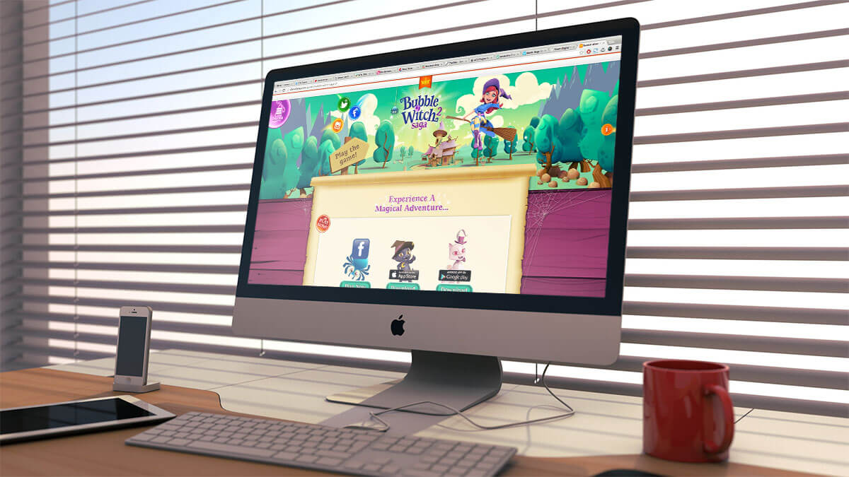
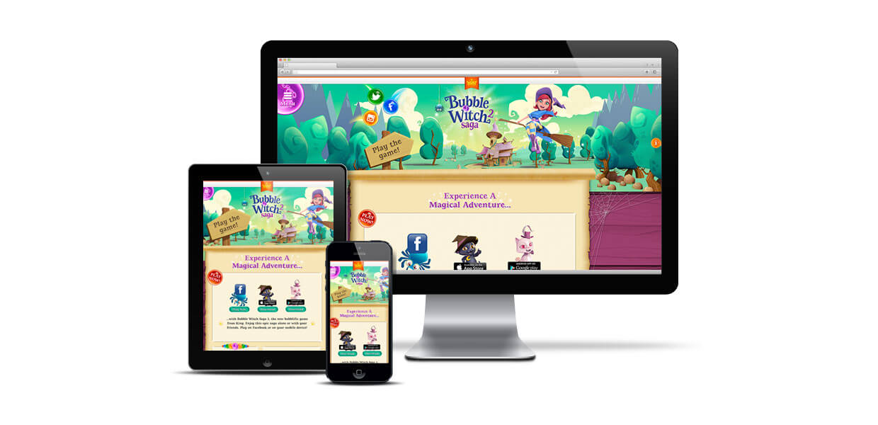
Villain & Co. approached us on behalf of King to design a responsive microsite for their newest game, Bubble Witch Saga 2. The site should be fun, not text heavy and designed in such a way that the template can be rolled out for future King titles. It must be responsive and perform equally well on Tablet and mobile devices.

The Solution
We decided to create a large scale Bubble Witch environment stretching the width of the page, within which we could place the key artwork and character whilst at the same time creating a high-impact, visual identity for the site.
For the content areas of the Bubble Witch Saga 2 site we again tried to keep as visual as possible whilst adhering to the responsive grid system, which makes the site scalable. We took great care to ensure that as many of the repeating image elements were tiled to keep the site as light as possible and to use shapes which are recognizable from within the game.

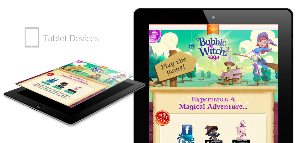
The Bubble Witch Saga 2 site scales elegantly and remains easy to use on all tablet and mobile devices. All buttons have been kept at the optimum sizes for comfortable use and the native ‘swipe’ functionality utilized where possible.


