Project Title
The College of Podiatry Public Website
Role
Design
Date
September, 2020
Client
The College of Podiatry
The Brief
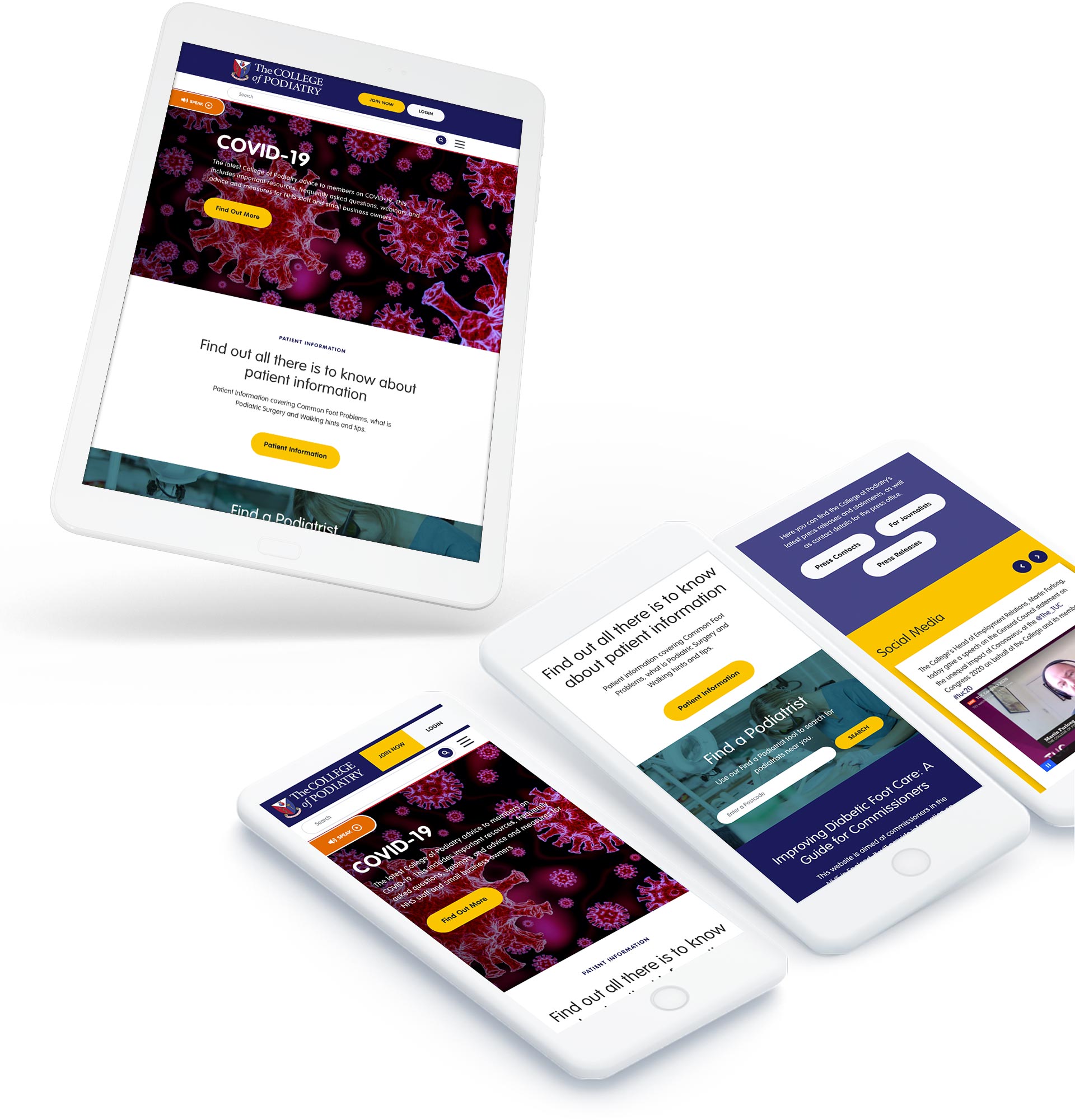
The College of Podiatry approached us to completely revamp the design of their public-facing web presence. The build side of the project has already been put out to tender and awarded to APT Solutions and we were tasked with working closely with them and all major stakeholders to produce a set of page template designs and a comprehensive ‘kitchen-sink’ for them to be able to easily impliment across not only the public website but the companion app and members portal.
The Solution
We were provided with the College brand guidelines which gave us a colour-palette from which we could begin to craft the overall look-and-feel of the site. The primary colours of red and purple had to be the dominant scheme with the secondary colours used for CTAs and emphasis only. As the site needed to have an ‘approachable & friendly’ appearance we decided to use large-scale imagery where possible and ensure large amounts of text were presented on white backgrounds with generous spacing to allow for maximum readability and button styles were created in lozenge shapes in the strong yellow colour to have the optimum standout from the straight lines.
The designs were reviewed closely, many times by the College and the major stakeholders to ensure the layouts were always flexible enough to accommodate the full range of content for which they needed to perform. As part of this review particular attention was given to the responsive, mobile and tablet versions of the templates for which we focussed on every element of the UI to optimise them for these mobile devices and ensure users would have a seamless experience on any platform.


