Project Title
King Community Homepage
Role
Web application, Angular, CMS
Date
December, 2018
Client
King
The Brief
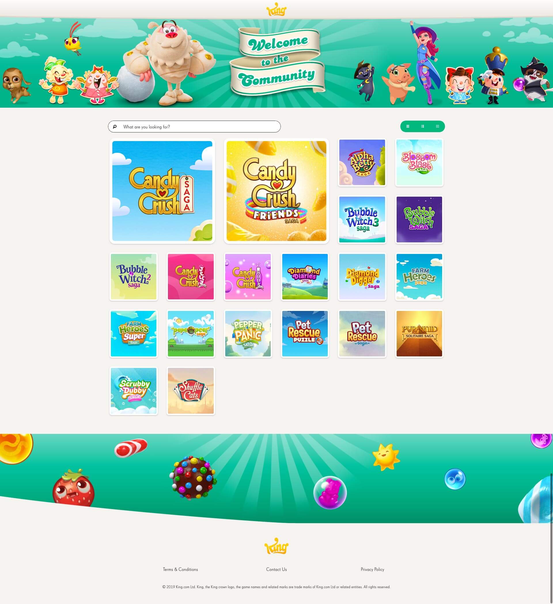
King wanted to upgrade their online community offering and as part of this required us to design and build a bespoke homepage for the site which would act as a more attractive gateway into the various games community hubs. They should be able to add new games as necessary and link them to the community site as a whole.
The Design
From the brief we started looking into various similar community sites, seeing how they, too, highlighted their featured products, articles, and other areas that were important. We decided that wireframing would be key to get through multiple structural options and, because the user journey was key, we decided to use Adobe XD to present them to King as a working prototype. It meant they were able to follow the user story click-by-click throughout.
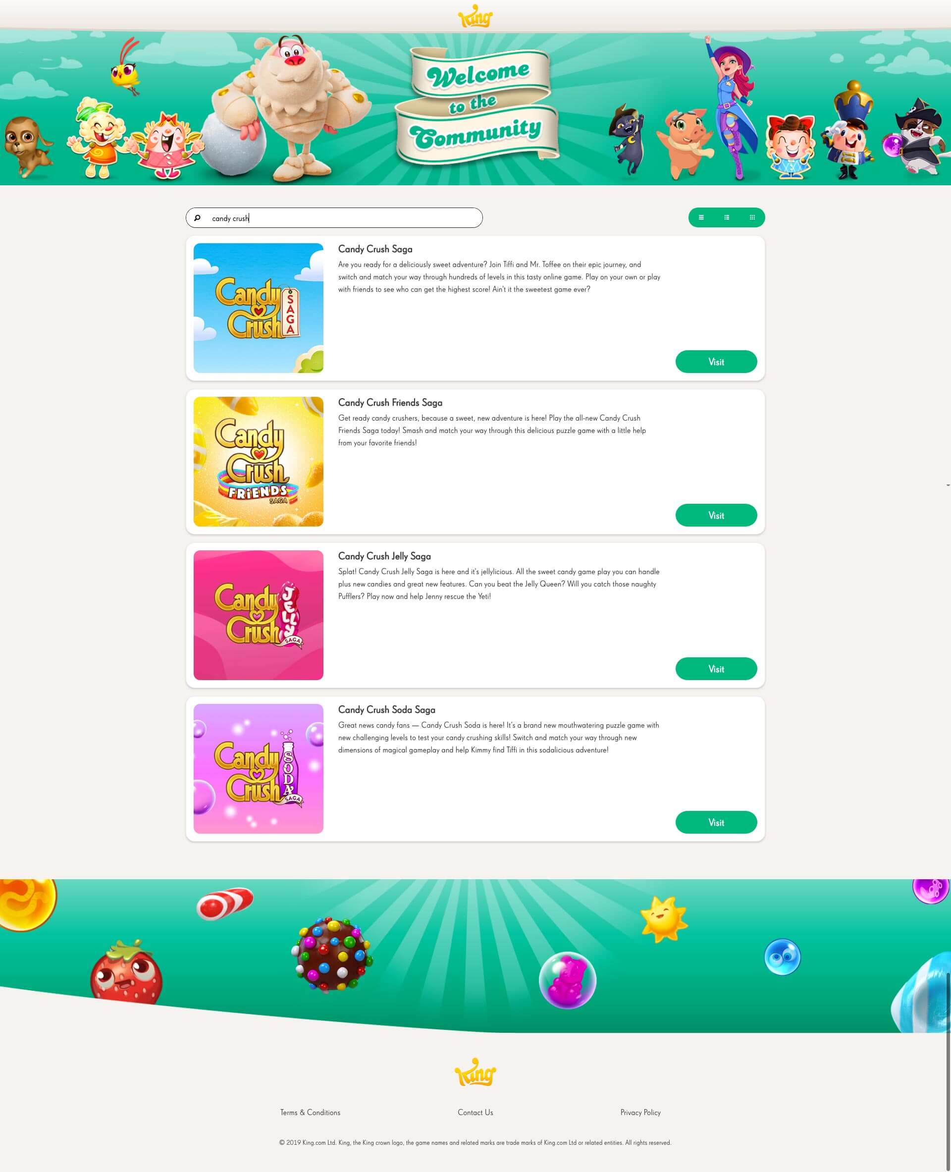
A prominent search function and the ability to promote featured games helped indicate the style of the structure, and we thought the UX would benefit from the ability to choose the tabulation of the tiles we produced.
Once these were in place we worked with Villain to produce the designs, using their creative knowhow and familiarity with King’s style-guide to help shape the designs before creating them in Sketch and sending them on for review.


The Solution
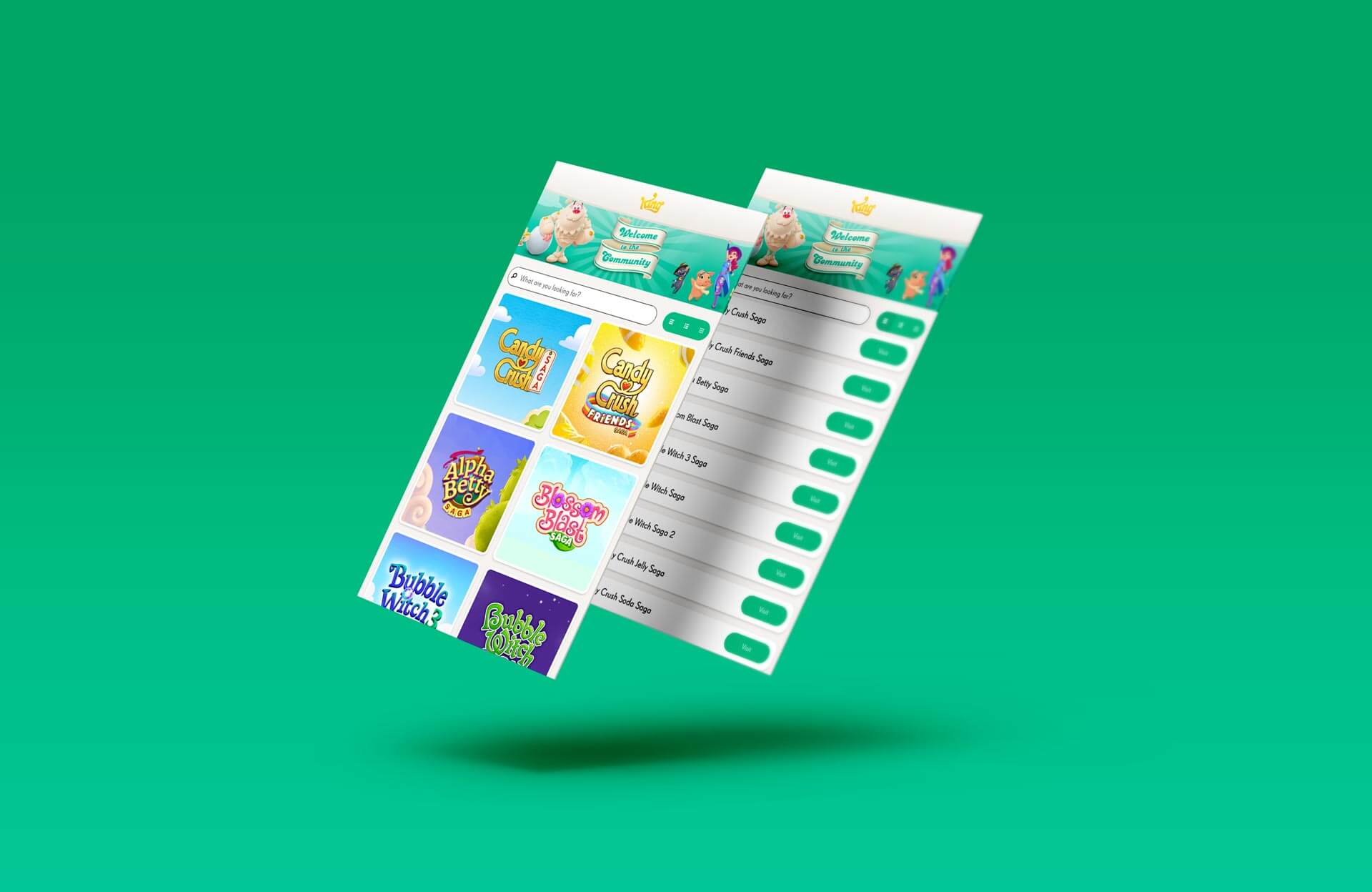
The Solution development was a fun Angular challenge for our dev team. We took a copy of the CMS we had previously developed for King and repurposed it to provide a very easy-to-use backend to populate the tile images, brief introductory texts, and links to the game-specific community pages. Our dev team then put together the frontend WebApp in Angular, creating a really light pre-loader meaning the site works responsively and quickly, loading additional data in the background once the visible sections are being displayed.
King were really pleased with the result, and as a direct result asked us to look into their next big project, the HelpDesk.


