Project Title
Lover or Gratifier
Role
Design, Development, Angular
Date
September, 2013
Client
Reckitt Benckiser
The Brief
Design & develop an internal online application, which through answering a series of simple questions could tell the user whether they were a ‘Lover’ or a ‘Gratifier’. The app would be used as an internal questionnaire tool in the Reckitt Benckiser offices where employees and guests would be encouraged to interact on laptops or tablets and the results displayed on large flat screen TV’s around the office space.

The Solution
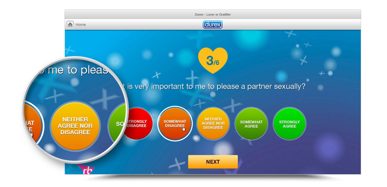
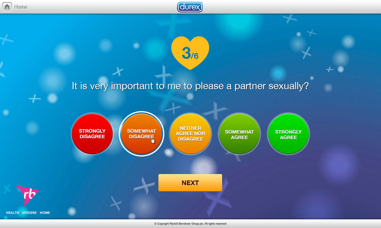
We were required to stick closely to the Durex brand guidelines and to make the app as simple and easy to use as possible. We added animation to the background using WebGL to give the app some energy, and this would also work across tablet devices.
Users were presented with the same range of answers for each question, ranging from ‘Strongly Disagree’ to ‘Strongly Agree’. To illustrate this we created large circular buttons and coloured them from red, through orange to green, adding a visual queue to each possible answer.

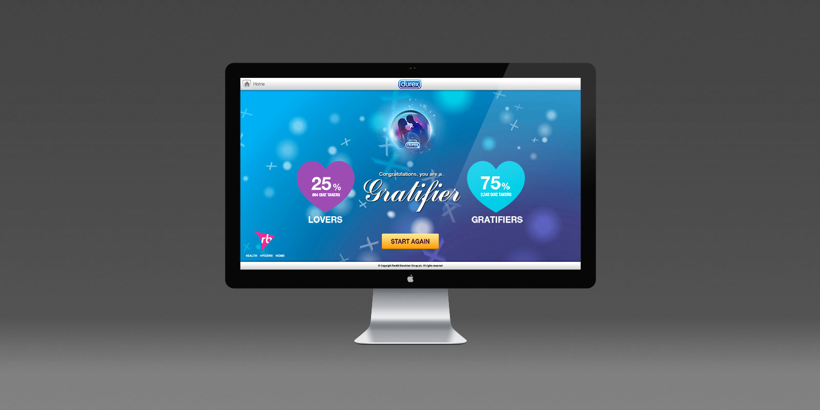
Once all 6 questions were answered, users were presented with their result - either a "Lover" or a "Gratifier". We also displayed the overall results of all the people who have taken the test. We tried to keep this all extremely simple and visual, so the information was easily readable and accessible.
The final piece we developed was a visual representation of the results data, which was displayed on TV screens around the Reckitt Benckiser offices. To do this we displayed the results numerically and with a pie chart, so it was easy to see which of the results was the most received.


