Project Title
Only You Clinic
Role
Design, Development, Wordpress
Date
November, 2017
Client
Only You
The Brief
The Only You Clinic is the brain child of leading Orthopaedic Surgeon Anthony MacQuillan, who approached us to create their brand identity and web presence from the ground up. Both elements needed to reflect their position of being a premium, luxury brand offering the finest natural skin care and aesthetic surgery.
The target audience for the clinic is predominantly (although not exclusively) female, and as such must feel approachable and feminine whilst also being clean and modern in style. In a predominantly male office we had our work cut out, but we’re always up for a challenge!

The Brand
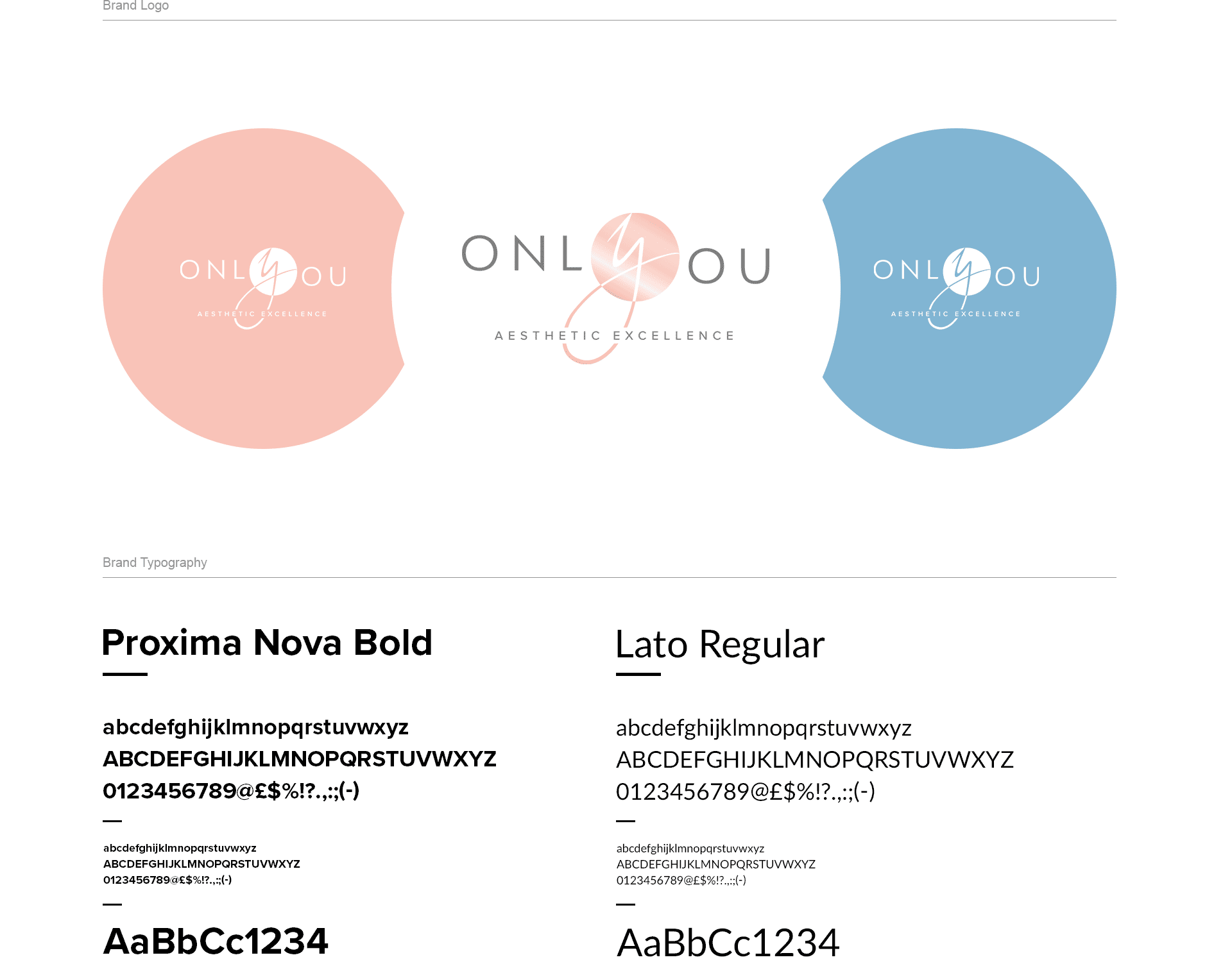
We began looking into the logo and branding for the clinic by carrying out thorough research into the cosmetic surgery marketplace. We found many existing brands tend to look quite traditional and staid, using largely serif fonts and classic, tired imagery. To stand out we needed to create something with a nod to the classic script iconography, but with a modern twist to bring something striking and distinct to the brand.
To align with the brief, in terms of colour scheme, we opted for a softer, conceptually feminine palette, yet at the same time bolder than the traditional palettes seen on other cosmetic brands. We were tasked with creating female, male, and neutral colour palettes, as well as one for their partnership with The Celtic Manor Resort & Spa.
Significantly, we deliberately stayed away from serif fonts. With Only You being such a pioneering, modern, and progressive clinic we wanted to create a brand which aligned with these values, so chose simple, clean, and above all easily legible font faces.

The Website
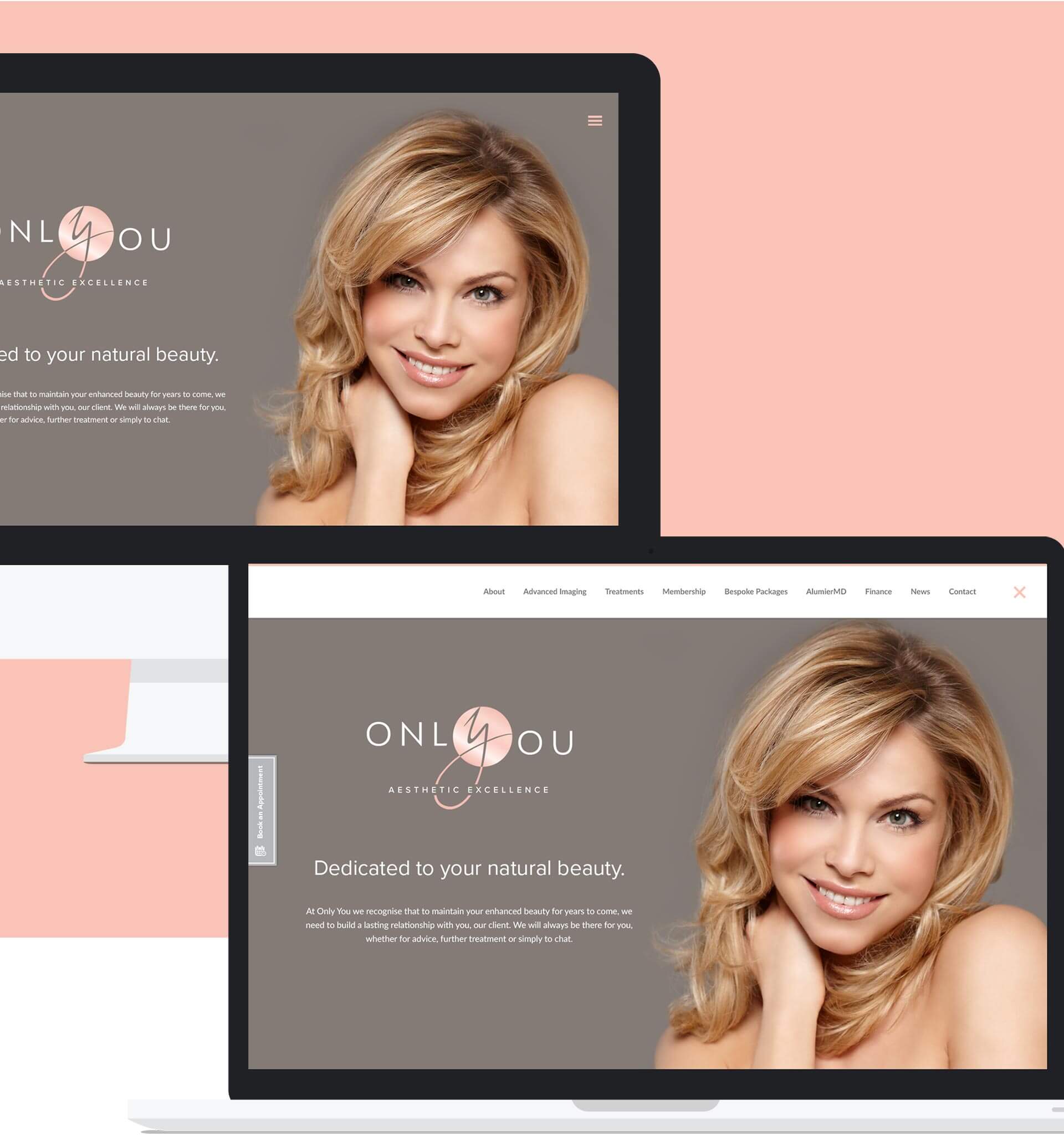
With the website being the primary first-stop public face of the Only You Clinic we really wanted to make the homepage a striking first impression for potential clients. Utilising some of the stunning photographs captured at a photoshoot we designed a clean, simple homepage with a hidden navigation which focused the attention on the clinics key messaging. We also created a bespoke logo intro animation which plays before the homepage loads to add to the ‘premium’ brand feel of the whole site.

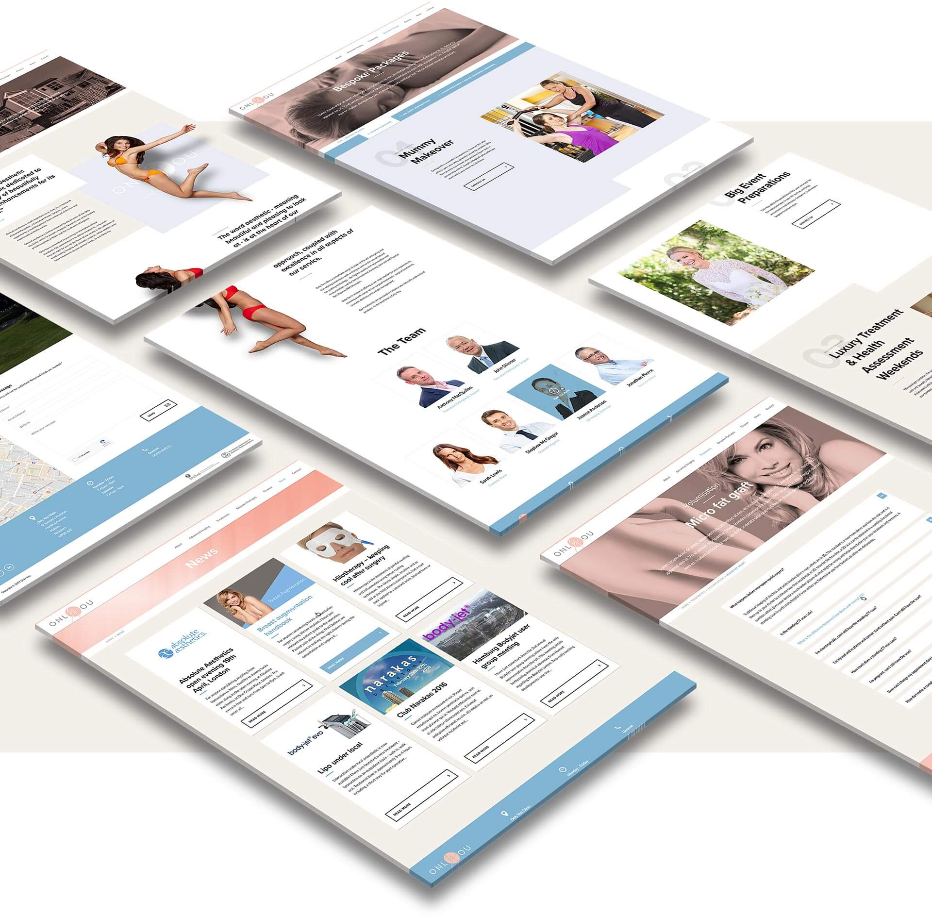
The main focus of the site was to be to provide easy to access, digest, and understand information on the myriad treatments and treatment options which the Only You Clinic offers. We therefore broke the treatments down into the most basic categories patients may be interested in, then within those categories laid out each of the treatment options available to them. These were all easily accessible not only from the bespoke homepage navigation but also from the top level site menu within an easy to follow mega menu.
Additionally Only You wanted to provide patients with information about the clinic itself and about their unique philosophy and approach to skin care and aesthetic surgery. We created a page which isn’t text heavy, but rather highly visual, focusing in on the key differentiators that define the clinic. The site also provides information on all of their complimentary service offerings, such as spa breaks & packages plus the various areas of 3D imaging which they offer by utilising some of the most state of the art scanning technology available today.

In terms of technology we built a custom WordPress theme using ‘Foundation Flex Grid’ which gave us the flexibility to create a beautiful looking and performing site whilst allowing the client an ubiquitous CRM to update the content as-and-when they wish. All of the content on the site is updatable, and with the custom ‘upload guides’ we provided to the client, integrating new content in the future is assuredly simple.

