Project Title
Sovereign Tourism Company Website
Role
Design, Development, Wordpress
Date
June, 2019
Client
Sovereign Tourism
The Brief
Sovereign Tourism are a premier B2B tour operator with an outstanding history of 46 years at the top of their game. To continue this performance for at least another 5 decades they spoke to us at Biff to redesign and develop their website as a destination calling card for clients old and new.
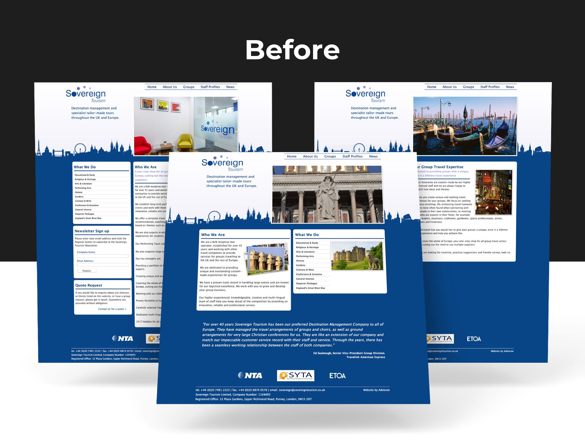
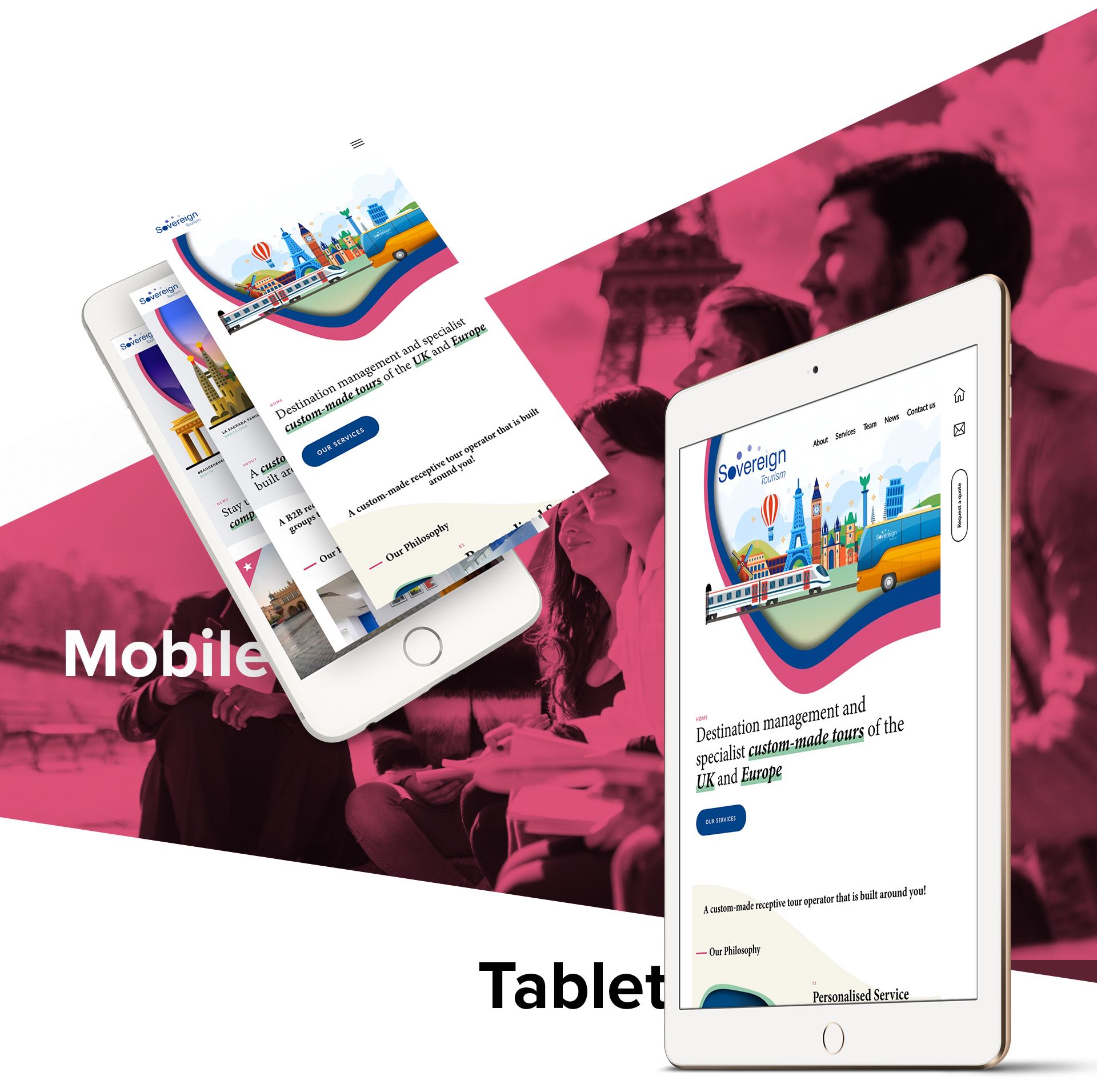
The former site was built at the cusp of the mobile explosion, meaning there had been little to no structural update for a good 8 years, and unfortunately the site was not responsive. Text-heavy, it suffered from a convoluted UX and a complicated data structure built up over the years. Sovereign, therefore, had a strong desire to simplify and consolidate it, making a brand-new superior site which reflects their past but looks to their future.

The Solution
The first thing we needed to address was the UX and data structure. We assessed the existing site and discussed in depth with the client what they wanted to keep and what they wanted to review and / or remove, so we cleaned up the data and created a simple and effective site map to ensure the designs fit well within a refined structure.

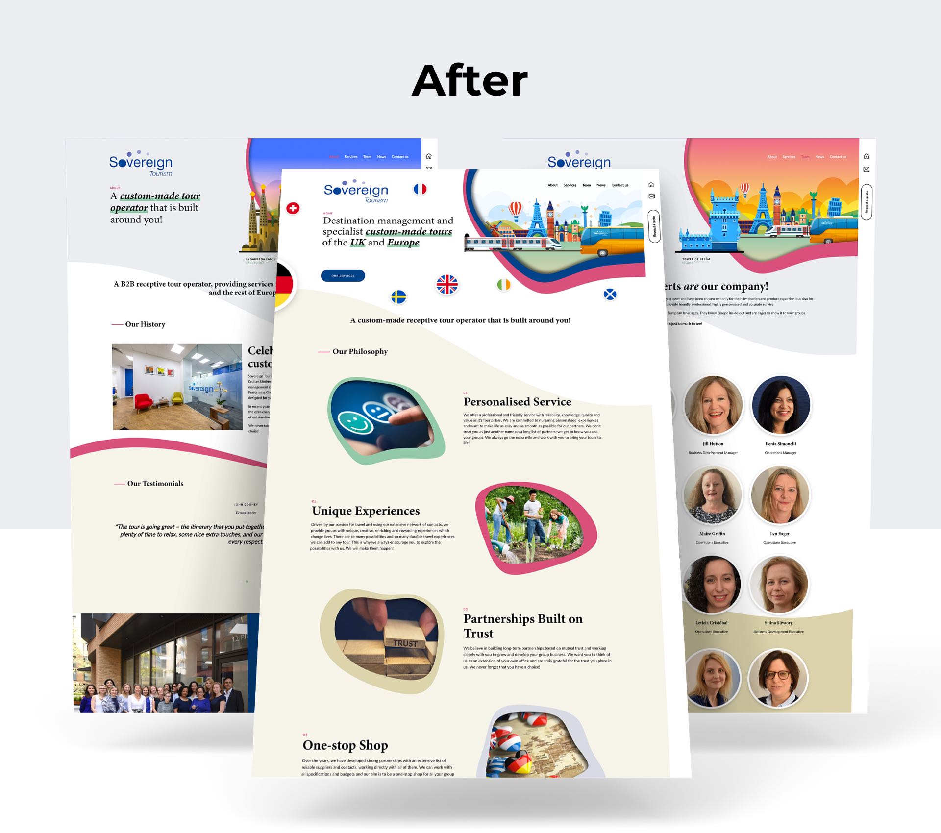
Our lead designer had been playing recently with the on-trend concept of paper cut-out styling across websites, which generates a sense of fun and playfulness completely in line with the approachable attitude of the company and also with the idea of holidaying and tourism, so he started working on integrating this into the headers of the website to draw the visitor in straight away and to help boost the existing branding of the company. We were also inspired by curves which helped make everything more approachable and fit in well with the cut-outs, so although our technical team initially said it wasn’t possible(!), we integrated many of these into the section dividers and our developers pulled some clever css tricks out of the bag to accommodate.

We thought the formality of the original site belied the real fun and friendly atmosphere we experienced when visiting the company, and as we got to know them, we realised that the biggest selling point of them is the people and the processes they bring to their industry and market, so we wanted to push this front-and-centre to the website. The homepage, therefore, begins with their philosophy, and we developed eye-catching and punchy headers to promote these and the core services they offer.

As one can imagine, the client wanted to ensure they were able to update and keep in touch with their customers as soon as there are any changes within the industry worth commenting on and helping SEO relevance by maintaining an active site presence. After positive discussions we agreed that WordPress would be the best tool to achieve this and also a superb and very user-friendly CMS to help the client keep the site up-to-date with ease and simplicity. We created simple easy-to-use training documentation and sat down with the client to ensure they were comfortable making any edits they required, standardising images and also integrating their newsletter meaning new customers could sign-up and instantly be added to the email lists for approval. We re-templated a couple of Newsletter designs and added those to help sovereign really create the re-brand impact they need to help them remain at the top of bespoke B2B for the next 46 years and more!

Kourosh Abbassi
Director
"Updating the website was something I had meant to do for a long time and the whole process was smooth and painless! Biff worked very closely with me and they understood our needs and created a site that not only myself, but the whole team at Sovereign are proud of. I also wanted to be able to manage most of the site content myself, and the WordPress backend couldn’t be simpler. Biff’s personal approach means that although the project is over, they continue to be helpful when I get stuck at any time."

