The Brief
The StandingCT Company is a new enterprise created by Europe’s leading Orthopaedic Consultants to provide mobile weight-bearing CT scanning in the UK and Europe.
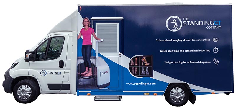
We were approached to design the livery for the first Standing CT vehicle to hit the streets, along with creating the online presence to include a unique online referral system for both patients and HCPs.
The van livery should visually stand out and provide the USPs of Standing CT at a scale which is clear and readable, even when the vehicle is on the move. The website must also promote these USPs, and additionally provide in-depth information on the product offerings for patients, clinicians, and hospitals. The online referral forms must be simple and easy to use and allow clinicians to receive and sign referrals before informing the Standing CT technicians of the new appointment. Patients must be able to self-refer, having provided all required information and, most importantly, having paid for the scan.
Van Livery
We began by arranging a professional photoshoot of the scanner, with a model demonstrating its use. These images were crucial for both the van and the website, illustrating to potential patients how unobtrusive and uncomplicated it is. We made the decision to simplify the imagery and messaging for the exterior of the van so that everything became ‘large scale’, thereby meeting the brief by being clear and easy to read when on the move or stationary.
For the interior of the van, where the actual scan takes place, we designed the rear wall so that social media information, the website address and a message reading ‘I’ve had a standing CT scan’ would be visible around the patient standing in the scanner so that the CT technician can take photographs for promotional material across social media channels.

The Website
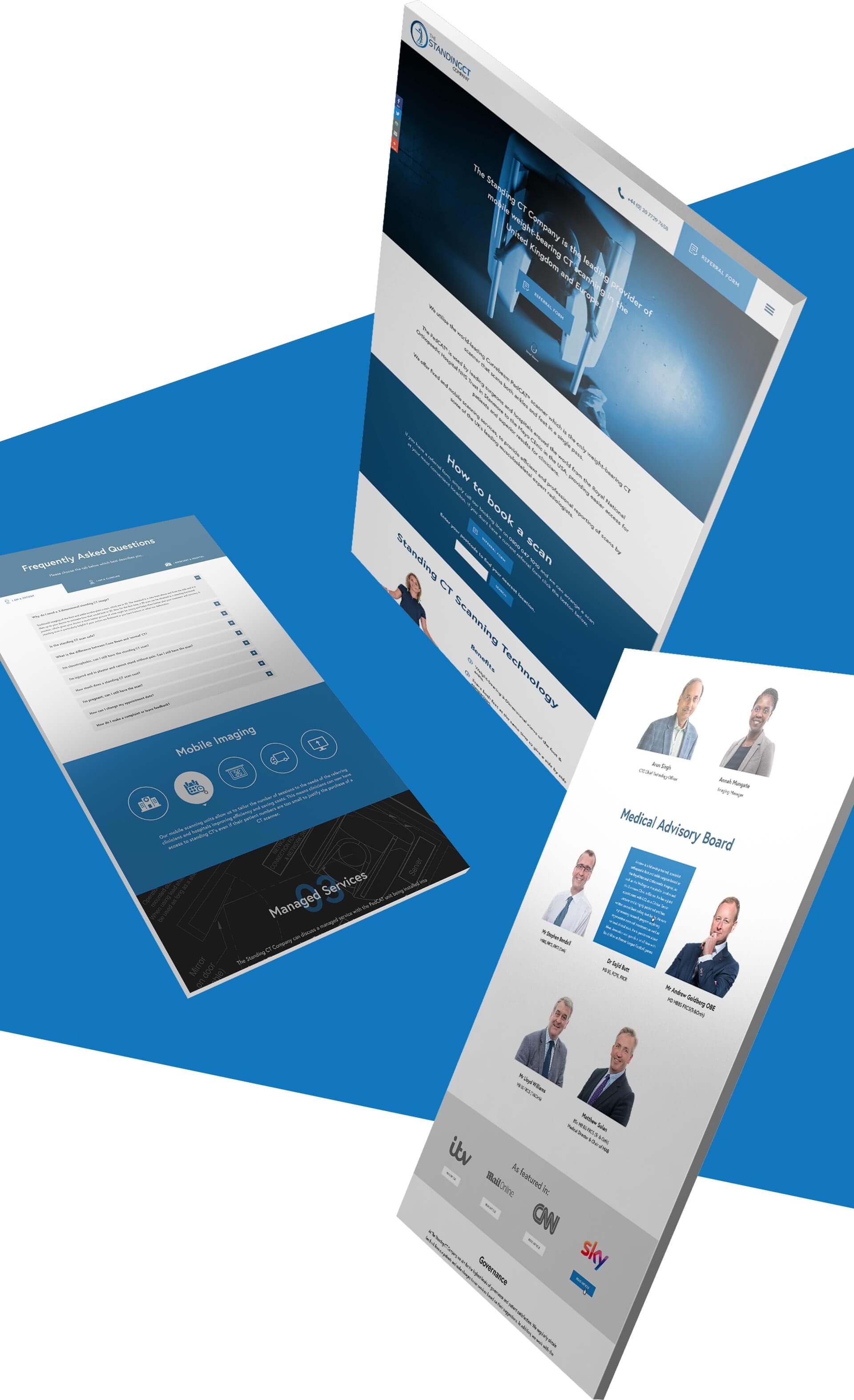
The primary focus of the website is for patients and Health Care Professionals to be able to refer or self-refer to arrange an appointment for a standing CT scan. To this end, the main CTA had to be to the referral form, so we positioned a clear CTA on the homepage and in the anchored top navigation bar, providing constant accessibility.
We decided the content on the website must be quite concise, using icons and bold imagery to convey this unique service. Simple animations on the content as the user scrolls through the page promoted a slick user experience whilst always ensuring ease of comprehension.
A tab system of FAQs, so that the various target audiences for the service (patients, clinicians, and hospitals) could easily access information specific to their usage requirements, was created. We also provided the user with the ability to search via their postcode to find the nearest standing CT location to them and the appropriate contact details.

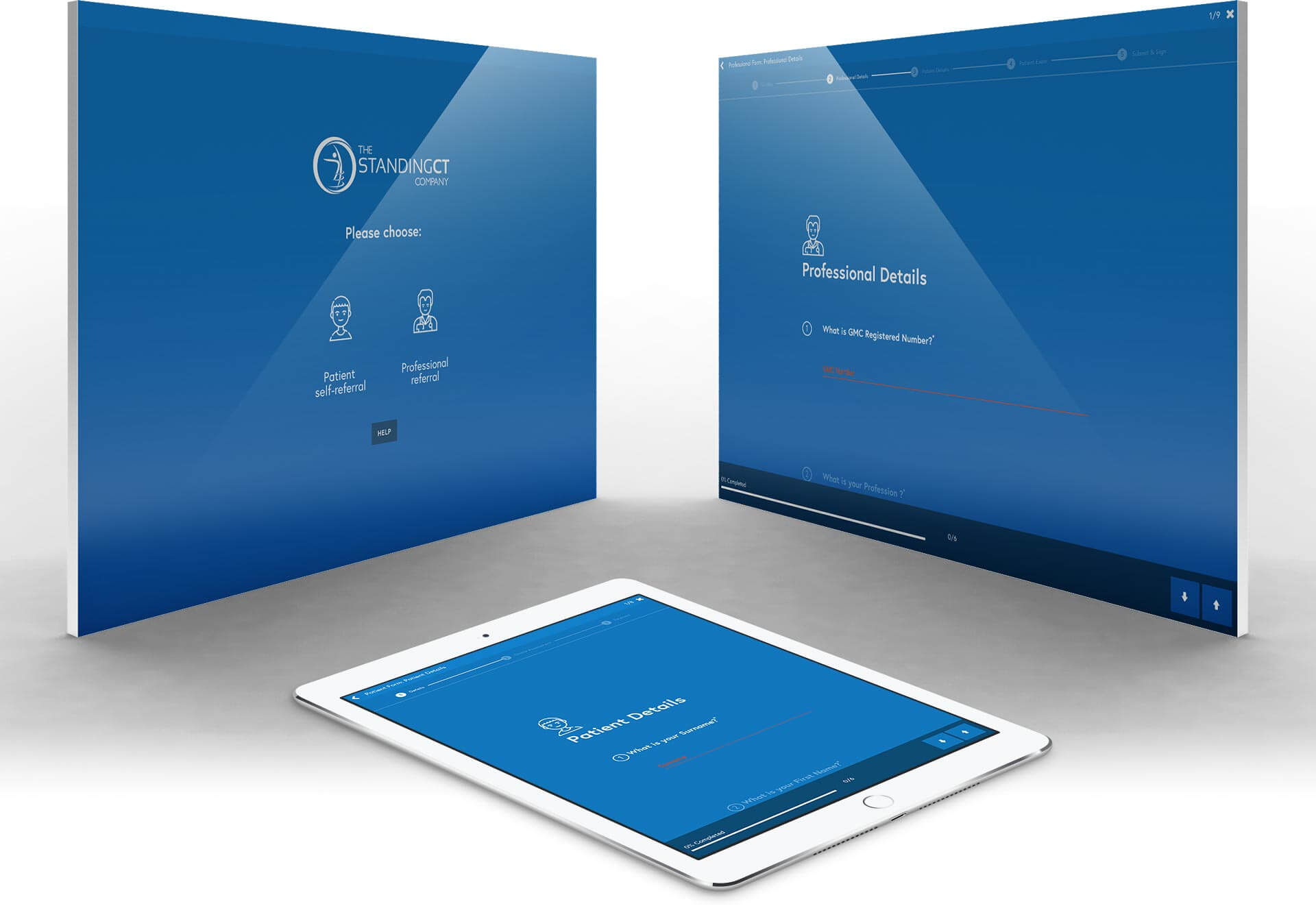
We developed a unique form which allows both clinicians to make referrals and patients to self-refer (as long as they meet pre-determined criteria and pay the scanning fee). The form flow was designed to be as simple and intuitive as possible by breaking each process down into clearly defined sections, and presenting each element individually, making completion as simple as possible. We believe we have distilled what could have been an intimidating and complex in a way that is clear, simple, yet also beautiful.
In order to make the process paperless we integrated Docusign to handle the approval and signing of referrals, and integrated PayPal to handle the self-referral patients. We have created a one-off groundbreaking system. It makes gaining access to valuable CT scanning equipment much easier for thousands of patients in need.

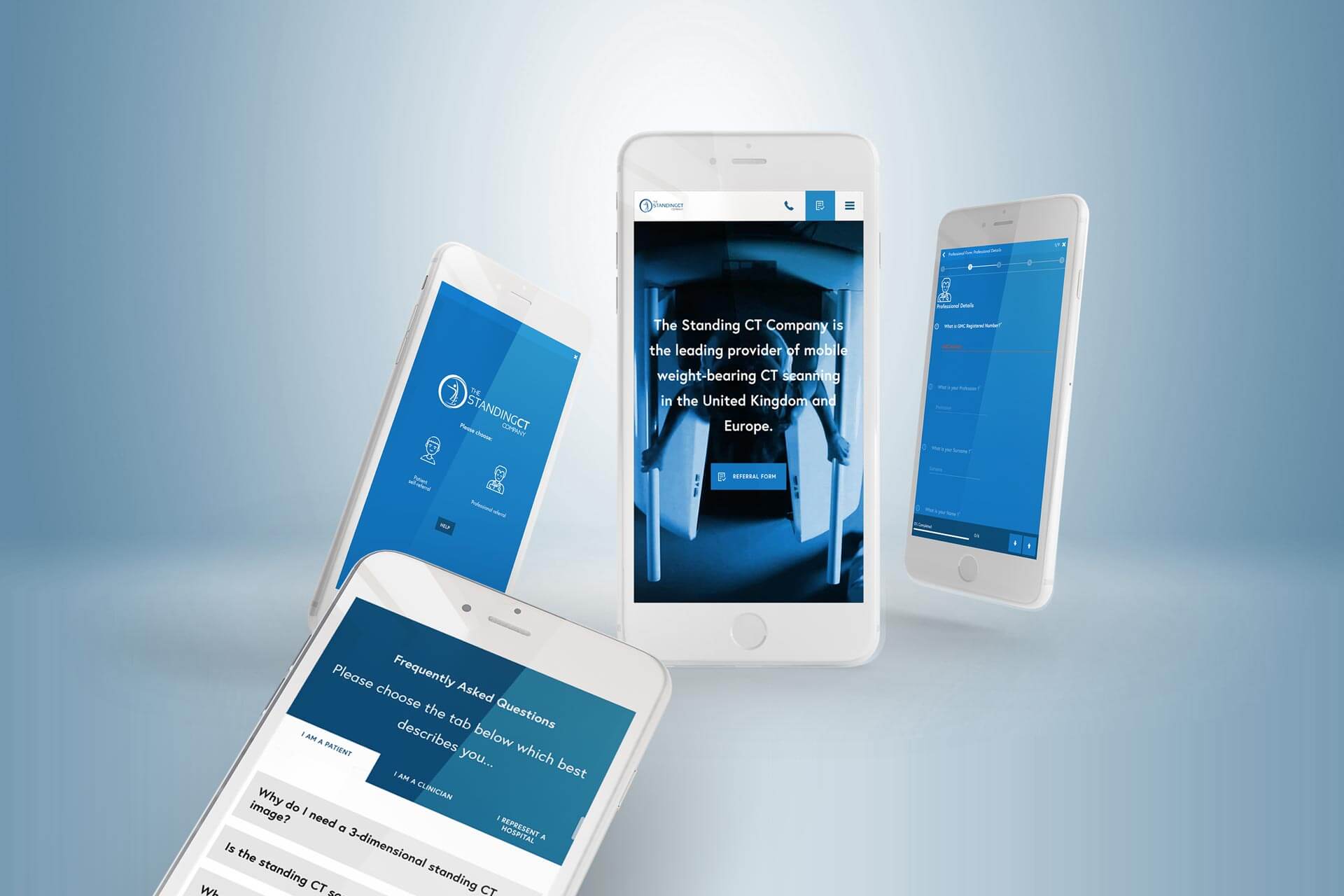
As with all Biff websites, we focused substantial extra time ensuring that the referral forms in-particular worked responsively across all devices. Special attention was paid to all UI elements to ensure a seamless UX across all devices.


