Project Title
Team 17 Games Website
Role
Wordpress
Date
April, 2018
Client
Team 17 Group
The Brief
Team 17 Digital are at an exciting stage in their life. Not only one of the most important and successful game studios in the UK, and a champion and distributor for independent game developers worldwide, but they have recently decided to embark upon a brand update following their 25th Anniversary. Setting their sights towards the world, they needed their website brought in line with the new, global, visual identity. We were approached to implement the visual branding and at the same time streamline the site structure, modernise the UI/UX and update their current WordPress backend.

The Solution
The new Team 17 logo was produced by our good friends and super-talented people over at Villain & Co. and it gave us an amazing starting point to begin developing the new website identity. The slightly refurbished but instantly recognisable purple long-associated with the brand provided a strong accent colour upon which we modernised the whole look and feel of the site. Whilst the ‘old’ site was responsive and perfectly functional, we felt that it needed simplification and to be given a more defined and easy to navigate structure.

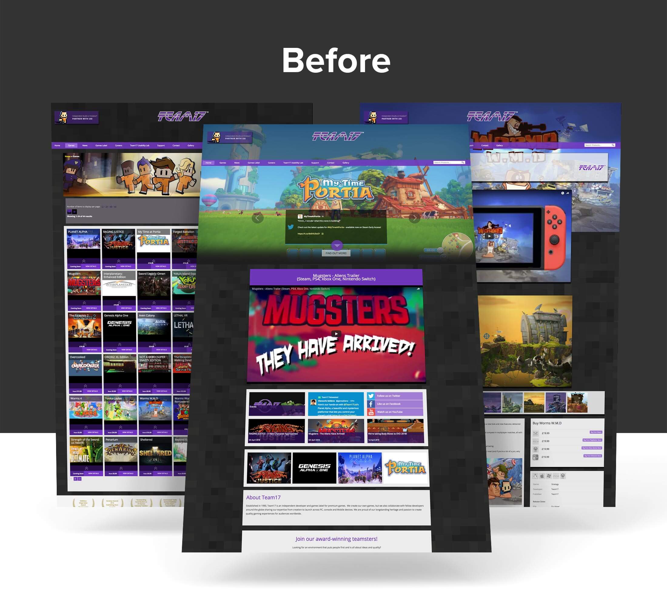
The old website had a dark background and used many full screen images. Combined with a high volume of content blocks scattered over the top, it quickly became quite tricky for users to navigate the site. Additionally, the content flow was such that it meant the pages became increasingly extended. Without any real hierarchy, the navigation was unfortunately complex.

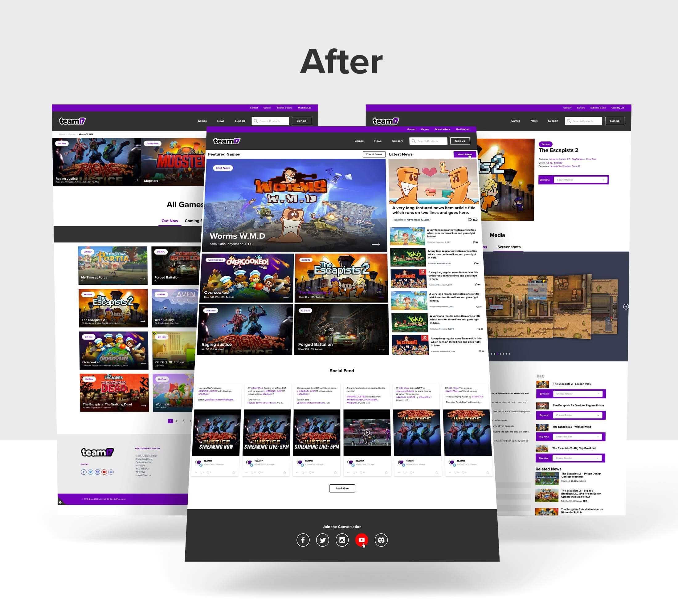
We began by giving far more prominence to featured games and daily news articles at the top of the homepage. We felt users should be able to view and access details about far more of their games directly from the homepage without having to scroll a long way down the page or utilise a carousel to find them.
We pulled the darkness and density away from the site and decided white had to be the background colour to provide a strong offset for the large amounts of featured game artwork yet allowing text areas to be clearly legible. The colour palette of greys and the accent purple allowed us enough scope to break up content areas and provide strong visual cues for users to access the content.
Of course, the site needed to perform across tablet and mobile devices and this is really where the newly revamped site outperforms its predecessor. We pride ourselves on thorough format testing, yet even here a great deal of time was spent testing various responsive layouts on these devices ensuring the use of far more intuitive touch functionality, even in the more content-dense sections, is far more user friendly.

The WordPress backend had become increasingly complex and convoluted over time as more and more features were required to accommodate the changing needs of the business, and more and more data was subsequently duplicated. The first challenge therefore was to exhaustively filter and transfer what we needed for our much newer and cleaner WordPress theme. The real success of this approach was to retain all of the data previously used, yet unify multiple sections into one, simplifying user engagement and ensuring future-proofing into phase 2 of the web-development project later in the year.
We have ultimately provided Team 17 with a far easier to use backend from which they can add new games, news articles, job posts and also make changes to most content across the site as the business grows and evolves.
Finally, everyone at Biff was super-happy to have the chance to work on the new site for the company that gave us Worms (the game, not condition!!) that we all played as kids, and we are so happy with the final result!
Ade Lawton
Marketing and PR Director
"We gave a tight deadline, but Biff attacked it with gusto. Not only delivering what we wanted, they nailed the brief, cleaned up the backend, and have helped prepare us for the next step in our rebrand adventure! We are incredibly happy with the result and look forward to working with them again in the future."

