Project Title
Wandboard Toastology
Role
E-Commerce, Wordpress, Magento, Design
Date
June, 2017
Client
Tristar
The Brief
Wandboard is a sister brand of the computing systems manufacturer TechNexion. Having recently completed a revamp of their entire web-presence, they requested we do the same for Wandboard. Aimed at growing their already keen community, the site was outdated and not optimised for the mobile devices this group live to tinker over, so we were approached to rectify this issue, push new purchasers to TechNexion’s key distributors, yet provide the option of direct engagement through TechNexion’s own e-commerce site.

The Solution
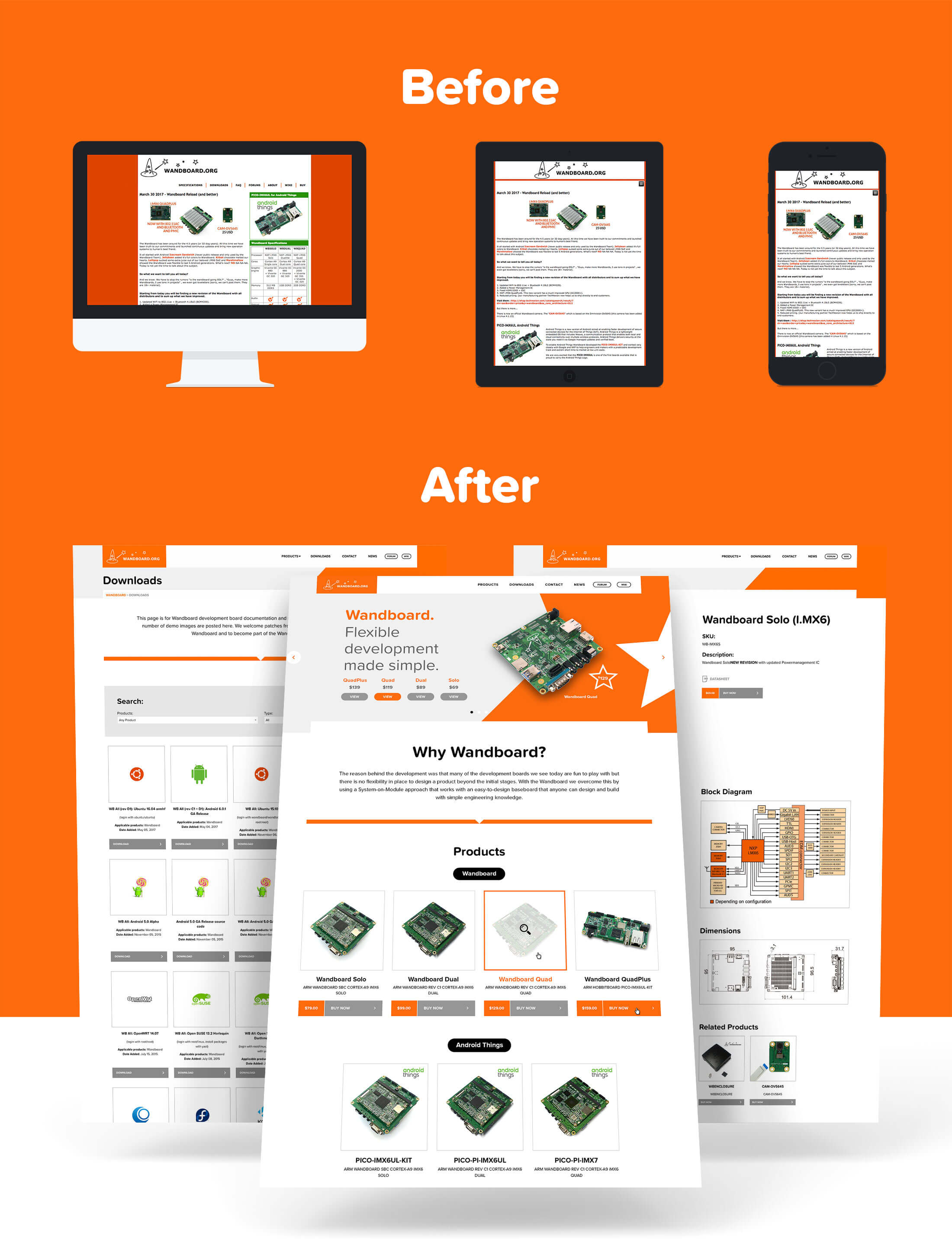
The first issue we had to address was the convoluted, disorganised, and organically developed site structure. Whipping out a blank sheet of paper, we crafted a considerably more streamlined, efficient, and intuitive sitemap and navigation system - the attention was focused more on each separate product group, and we furnished each product with its own dedicated page - a stark contrast to the jumbled, 'all-in-one' original.
Visually, we took their deep red/orange branding and tweaked it to a much more vibrant and modern orange, instantly perking the brand up in line with its innovative, playful nature. We then began creating a clean, super-modern site layout, utilising the minimialised effect of white space, with a strong focus on presenting the products and their purchase CTAs.

The main body of the site is developed on a custom built WordPress theme, however we also plugged the site into TechNexion’s existing Magento back-end, enabling us to pull in product data from the pre-existing database and provide e-commerce functionality by linking back to the TechNexion shop.
A huge consideration impressed upon us from the start was that the site must be able to grow as their range and business grows. With this in mind, we designed and built a fully customisable CMS to add these new ranges seamlessly, and slot them beautifully into the front-end. (An added bonus of the Magento hookup means product details remain consistent and can be managed in just one go!)

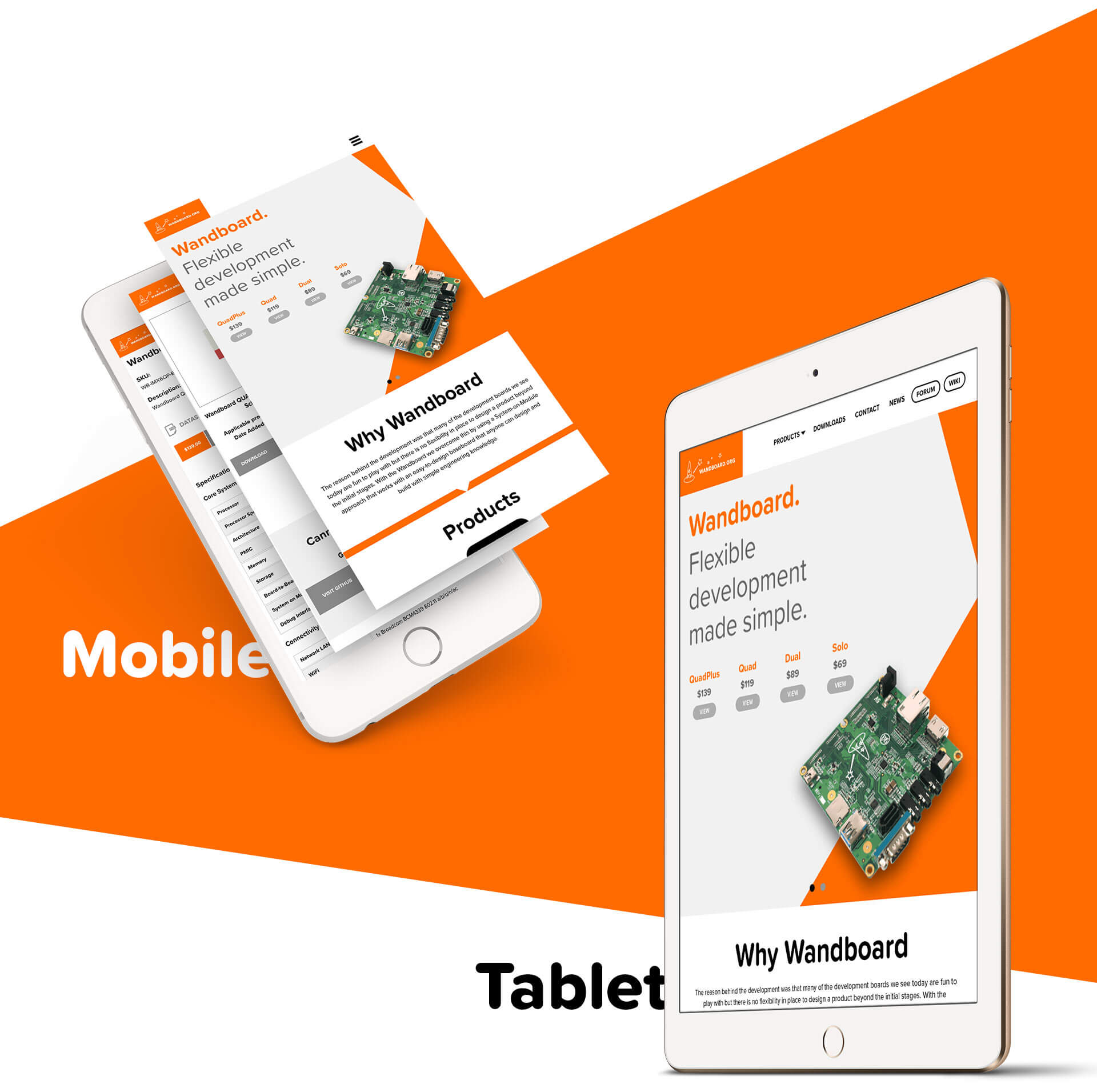
With internet usage rapidly moving from desktop to mobile, addressing responsive issues is a must, and we decided in this situation to use the ‘Foundation Flex Grid’ to do it. This gave us greater flexibility and loads more tools to present the site in its optimal form on all mobile and tablet devices. And with the beauty in Wandboard 2.0’s flexible framework, the site now looks and performs just as well on modern devices as traditional desktop machines.

